Example
This is an annotated example of the analysis of a state's political geography, using North Carolina as an example. The annotations below are shown in blue text like this.
At the top is a textual summary of the trade-offs. That is not shown here.
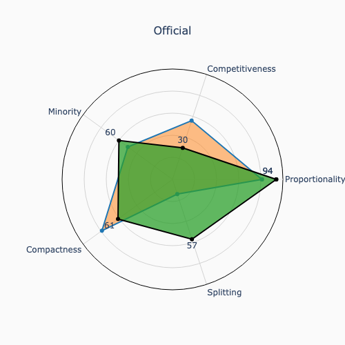
The official 2022 congressional map makes trade-offs (13, -26, 10, -18, 43) relative to the root map ratings (81, 56, 50, 79, 14) to yield (94, 30, 60, 61, 57) proportionality, competitiveness, minority opportunity, compactness, and county-district splitting ratings, respectively.
Similarly, the notable maps suggest some major quantifiable policy trade-offs:
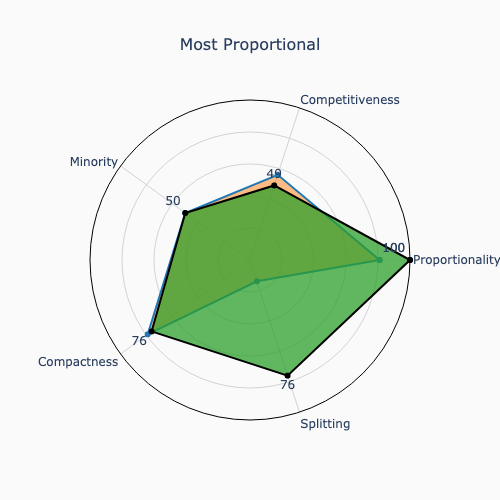
- The Most Proportional map trades-off (19, -7, 0, -3, 62) for (100, 49, 50, 76, 76) ratings.
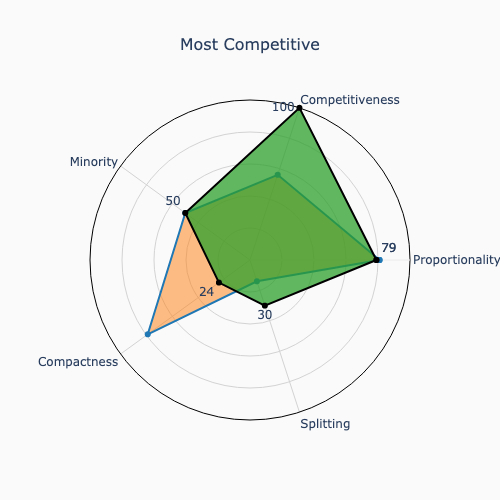
- The Most Competitive map trades-off (-2, 44, 0, -55, 16) for (79, 100, 50, 24, 30) ratings.
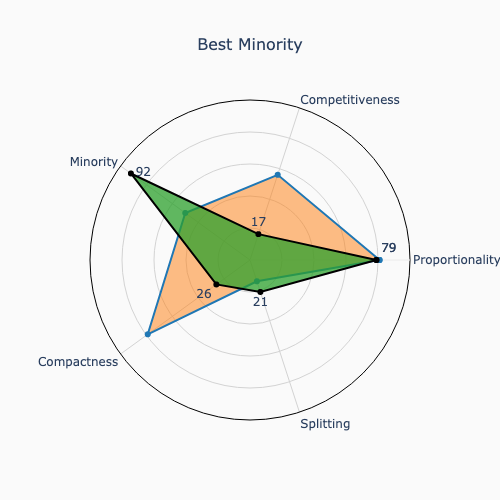
- The Best Minority map trades-off (-2, -39, 42, -53, 7) for (79, 17, 92, 26, 21) ratings.
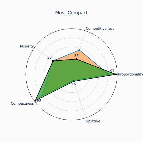
- The Most Compact map trades-off (16, -21, 0, 19, 2) for (97, 35, 50, 98, 16) ratings.
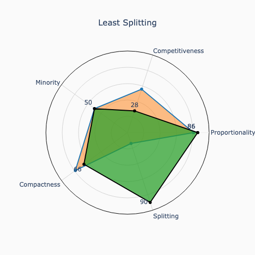
- The Least Splitting map trades-off (5, -28, 0, -13, 76) for (86, 28, 50, 66, 90) ratings.
Then the ratings for the official and the five notable maps that maximize proportionality, competitiveness, minority representation, compactness, and splitting are then compared to the ratings of the root map.
The first comparison is graphical with a set of pairwise radar diagrams. These show that North Carolina's official congressional map trades-off some competitiveness and compactness for less county-district splitting. They also show that North Carolina could have produced a maximally competitive map by reducing compactness. Similarly, they could have given minorities the greatest opportunity for representation, by reducing both competitiveness and compactness while still retaining a large degree of partisan proportionality.
These radar diagrams compare the ratings of official map and the five notable maps with the root map (orange = root map; green = comparison map):
|
|
|
|
|
|
The second comparison shows the ratings in tabular form for convenience.
At the end, there's a link to a detailed comparison of the district boundaries across these six maps.
You can see a detailed comparison of the district boundaries in these maps here.